Blackmail rebrand
Rebranding of a boutique store in Austin, Texas, known as Blackmail. Aside from selling its goods, Blackmail strives to create a museum-like experience for one to explore, entice consumers, and express a diverse yet dark-colored aesthetic. After meeting with the store owner, Gail Chovan, I came to the conclusion that while Blackmail currently has strong, impactful iconography throughout the store, it was failing to come through in the branding.
Problem: How to design a rebrand that feels fresh but also draws upon certain successful icons from the store?
Icons
inspired by animal iconography seen heavily throughout the store, I designed these 5 icons to support the superstition concept.
Brandmark
Alternate brandmark
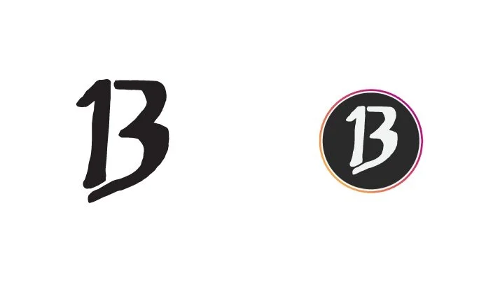
A more paired-down version of the primary brandmark, the alternate brandmark focuses on the most important part of the primarily brandmark, the “B” in Blackmail. This B supports the superstition concept; the letterform comprised of a number 1 and 3. It is especially used for in-store context and social media icons.
Minimum size: 14 mm should be the smallest size rendered.
typography
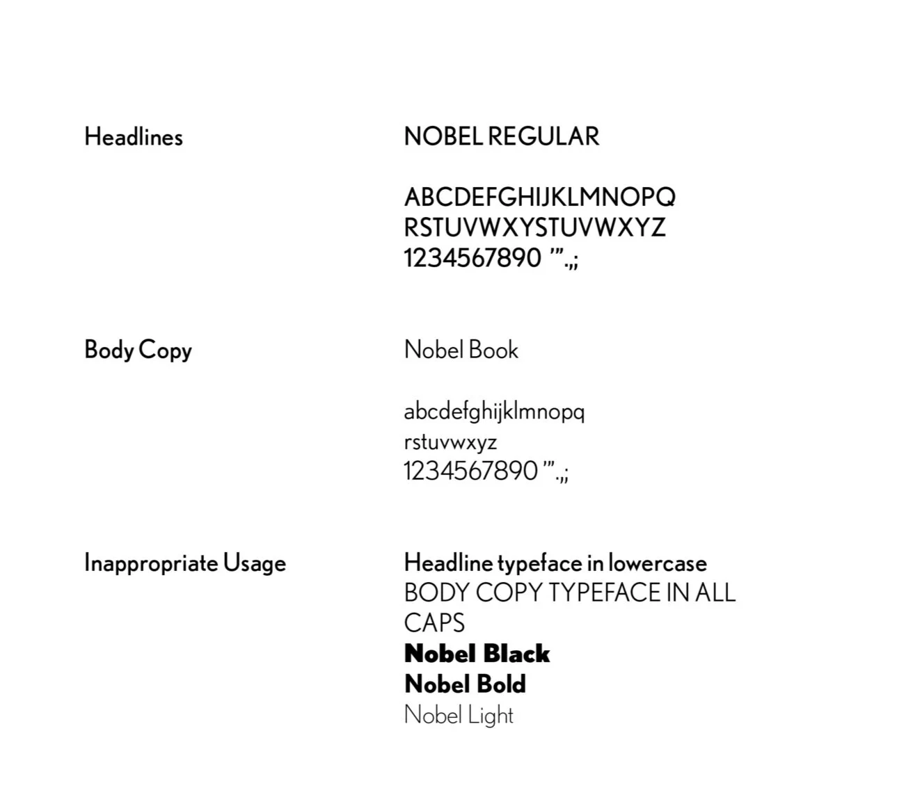
Nobel is a geometric san-serif typeface from the 1920s that lacks a strict adherence to geometric forms. Because of this, Nobel avoids many other early geometric sans’ sense of sterility and adds a hint of attitude that supports the Blackmail brand. Headline text should always be in all caps using Nobel Regular, and body copy must be in Nobel Book.
Color
As a colorless brand, I want to keep it simple. The primary colors are black and a light, cool grey. These colors are used for both brandmarks and iconography depending on what colors they are placed against. They are also used for type. Asphalt and a mid-tone grey are the secondary colors and are used mostly as backgrounds colors for patterned imagery using the icons.
PRIMARY COLORS
#F1F2F2 and #000000
Secondary Colors
#2A2A2A and #C5C7C9
The Rebrand
Solution: a superstition concept to support the rebrand.
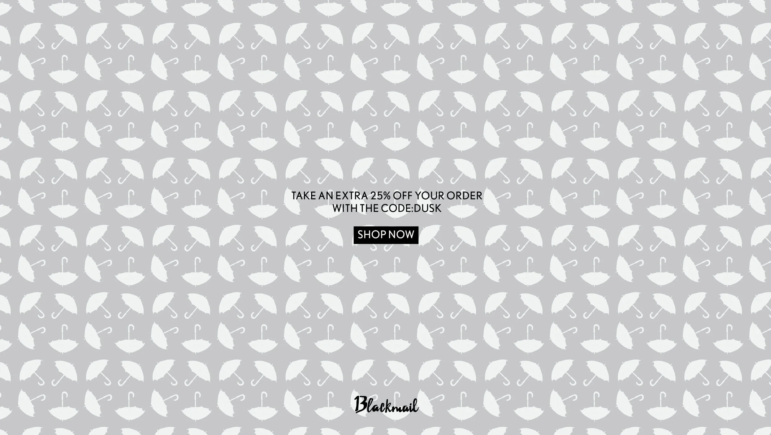
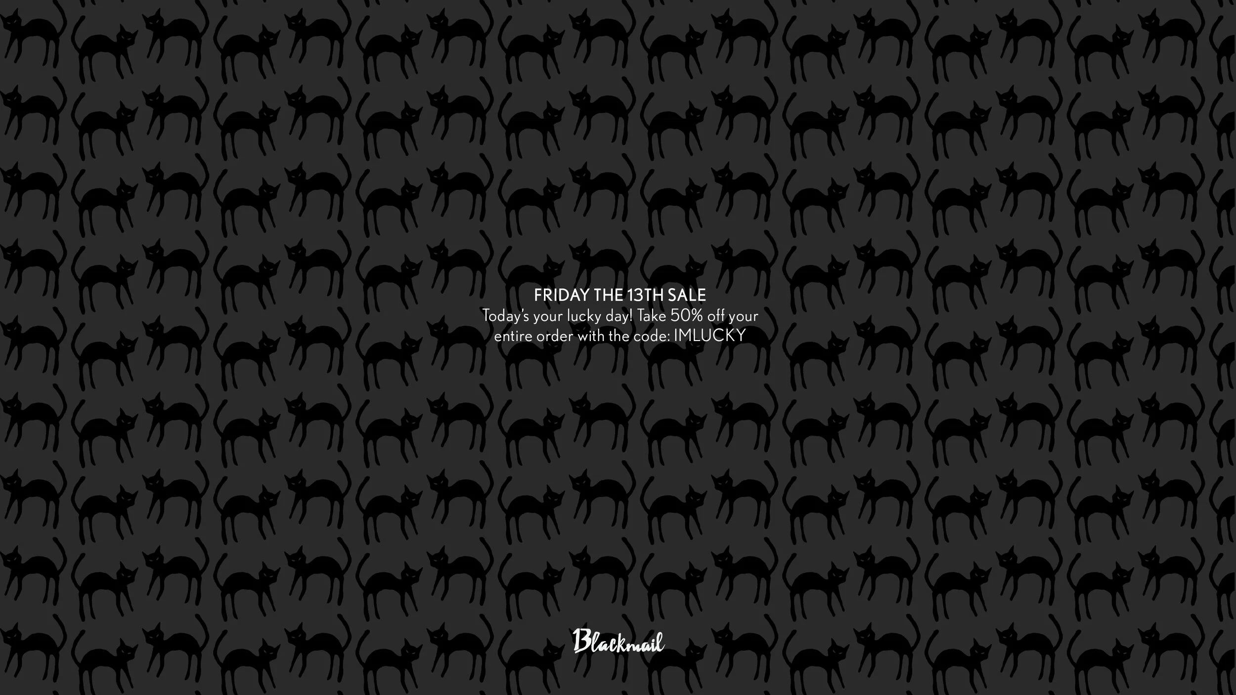
Advertisements for social + web use with typographic voice
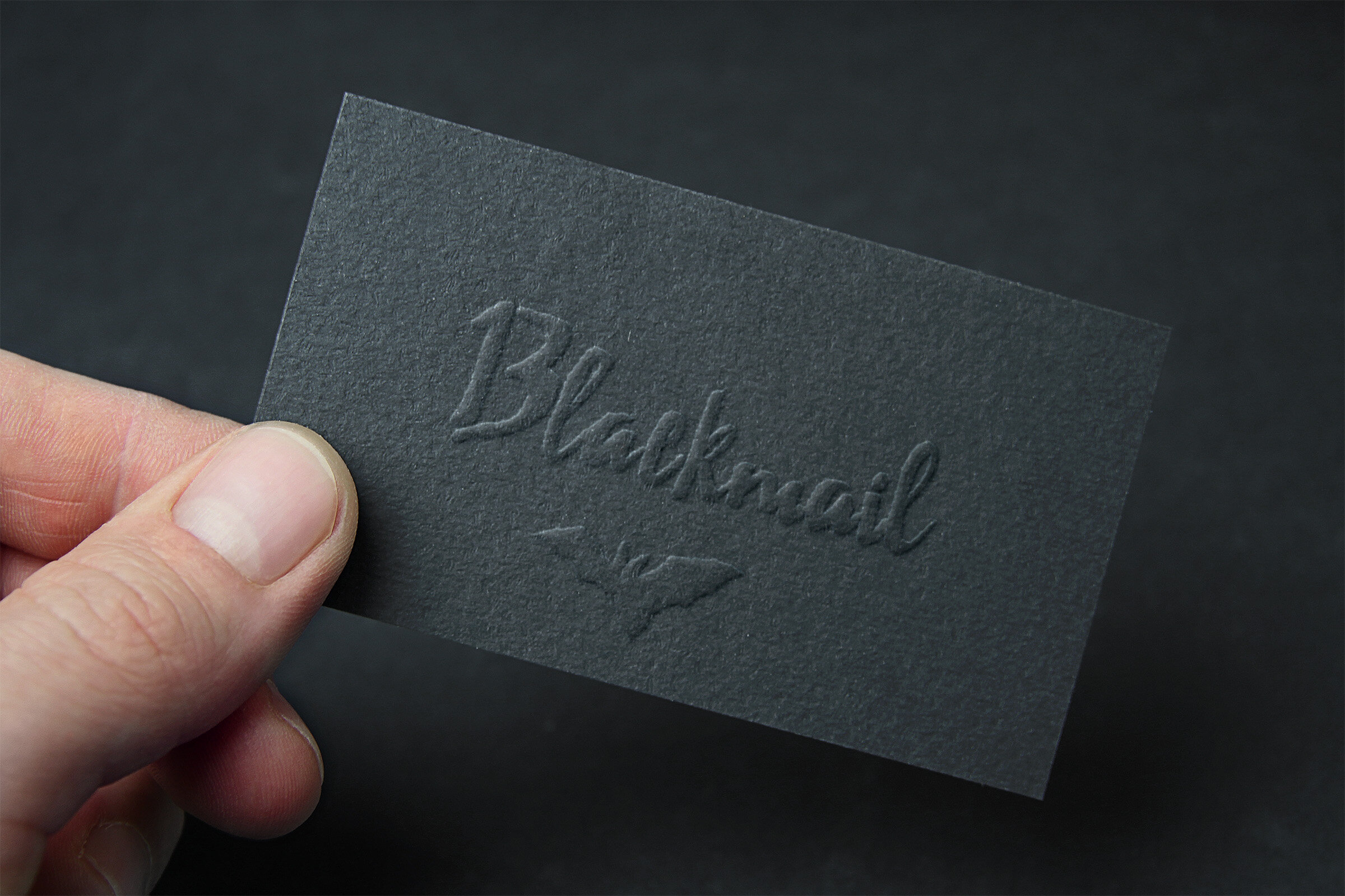
business card
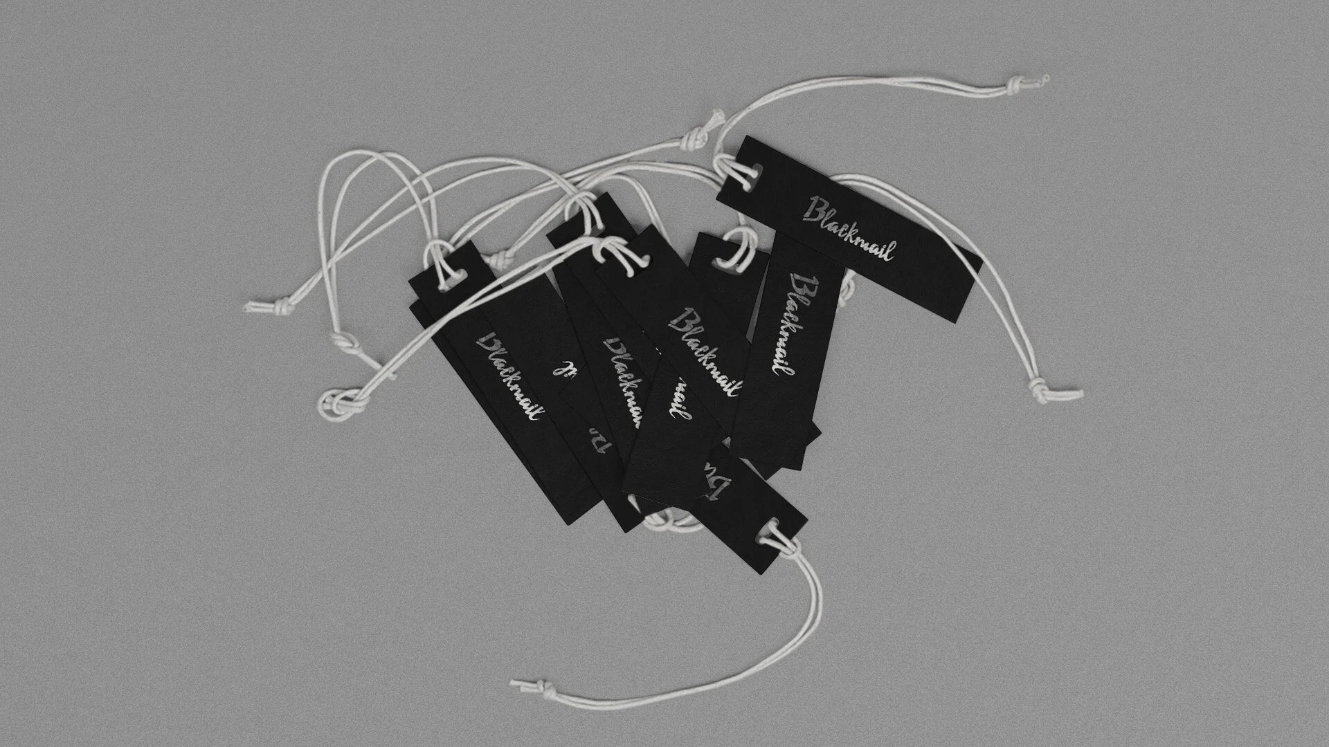
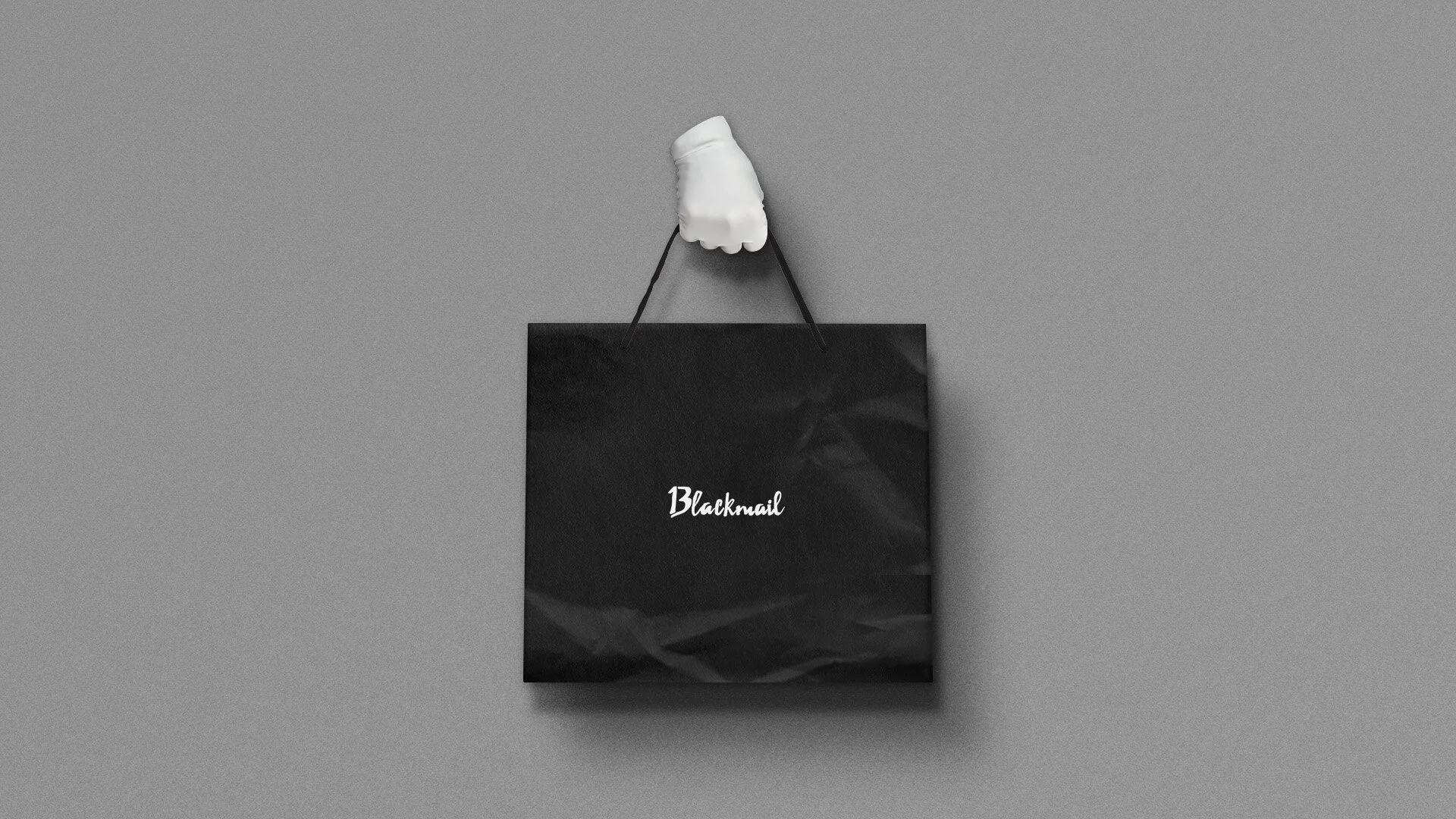
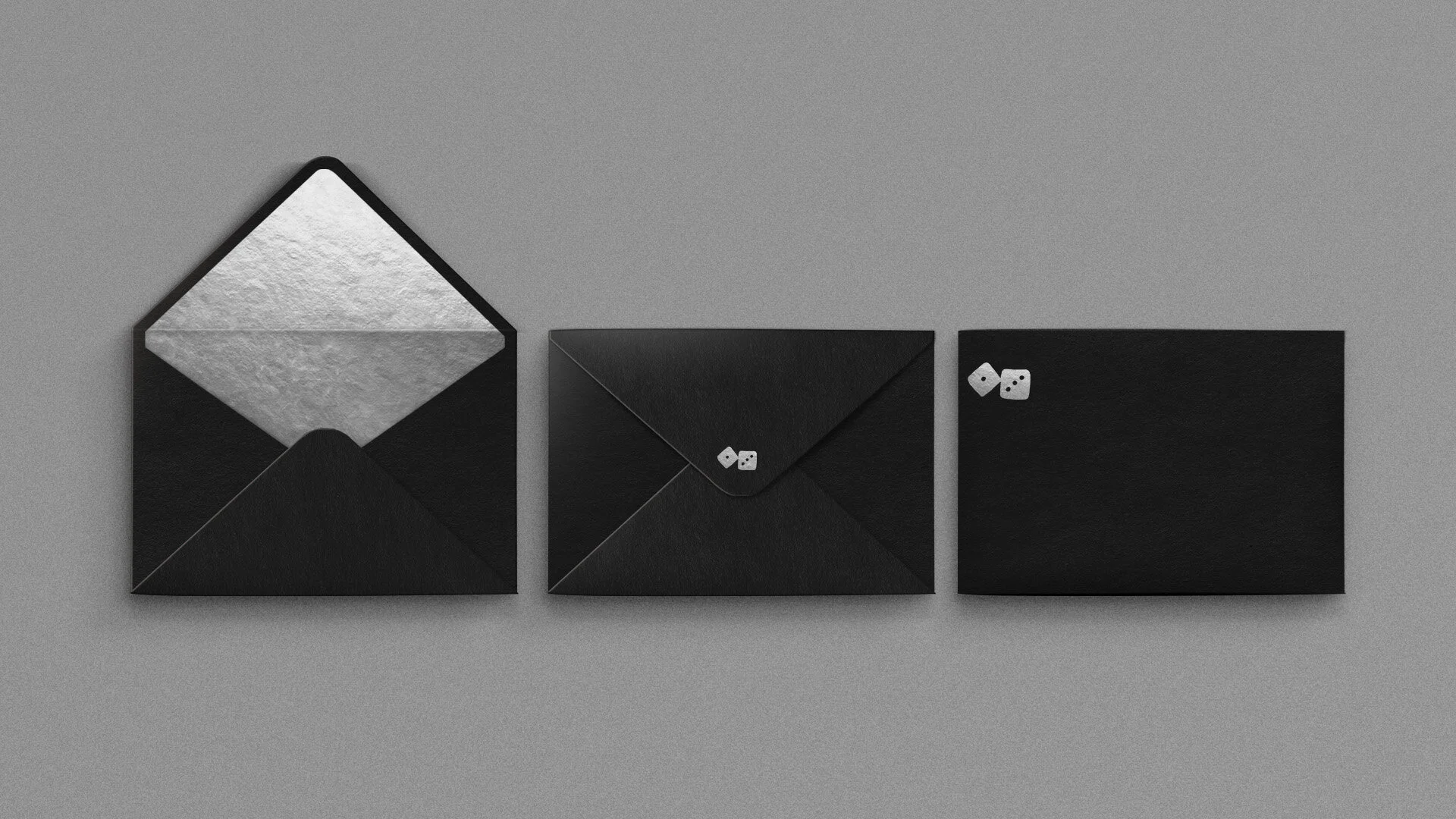
stationary using icons
stationary using icons
color & imagery Guidelines
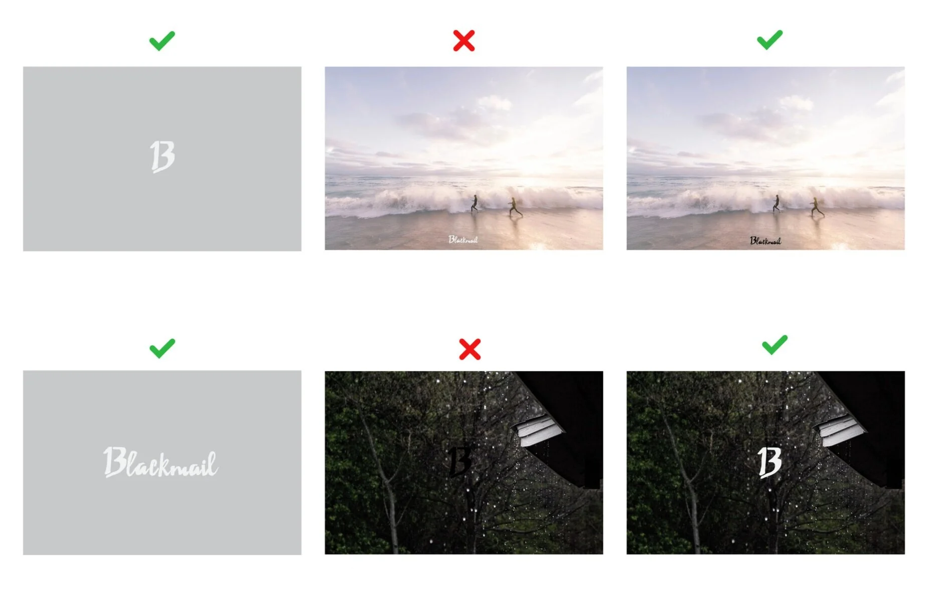
Aside from black, the Blackmail brandmarks and icons may only be rendered in the lightest grey color. The secondary colors may only be used as background colors for this marks when necessary.
The color selected for the Blackmail brandmarks must be the color that highlights it best on whichever image it is used in front of.
Photography will be used for advertisements and campaigns. They should either illustrate a lifestyle that is in line with the brand or use the color black used in ways that express totally different moods.
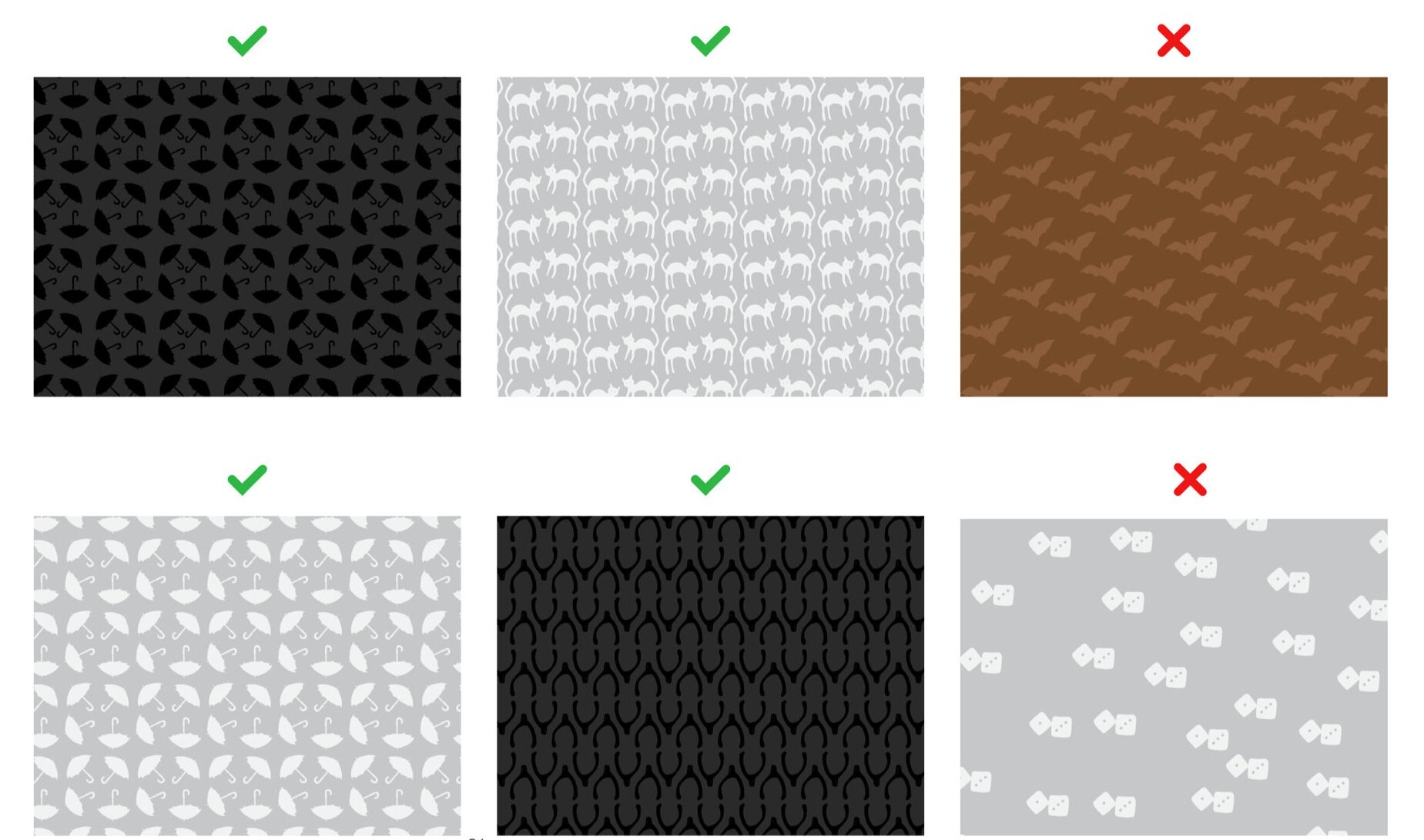
Patterns made from the icons must be rendered in the correct color and with cohesive and tight spacing. Patterns should be uniform throughout.


