Blue norther hard seltzer
Blue Norther is an Austin-based hard seltzer that exists to bring people together with great tasting drinks. Dissatisfied with the dull taste of other seltzers, the co-founders set out to craft their own seltzer with a focus on quality, Texas heritage and bold flavor.
Since June of 2020 I’ve been on the creative team of Blue Norther Hard Seltzer. As the only internal creative for such a small startup, I had the opportunity to wear many different hats and make a large impact to the company's development. I worked as a brand designer, marketer, project manager, art director, and designed all the merchandise.
brand design
PACKAGE DESIGN
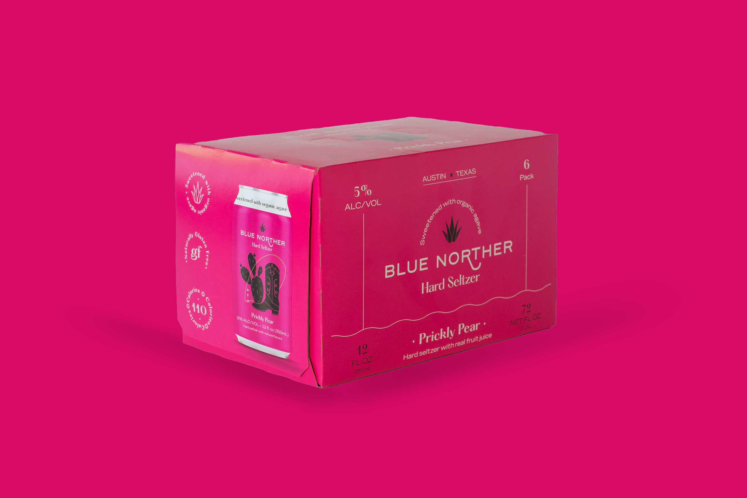
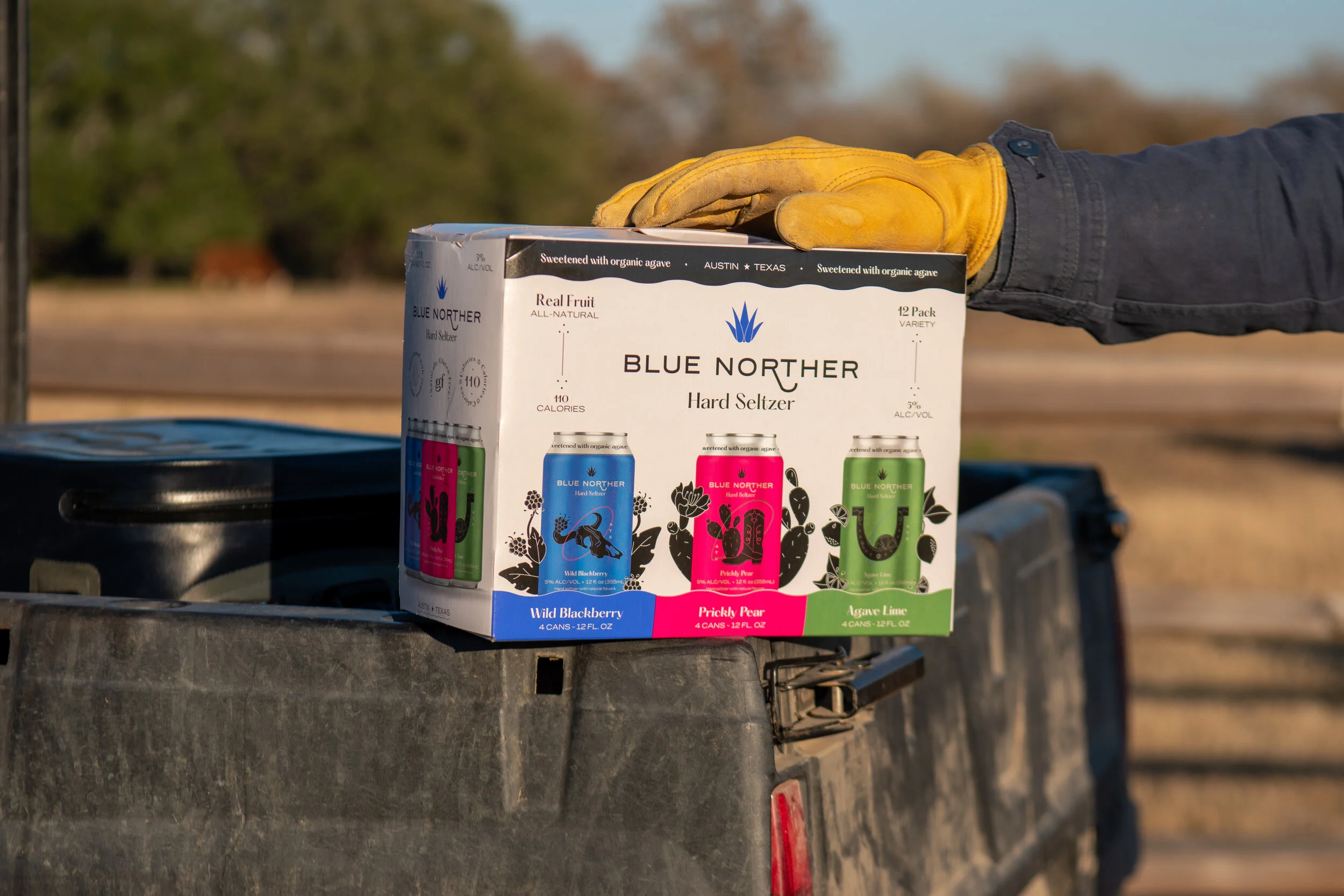
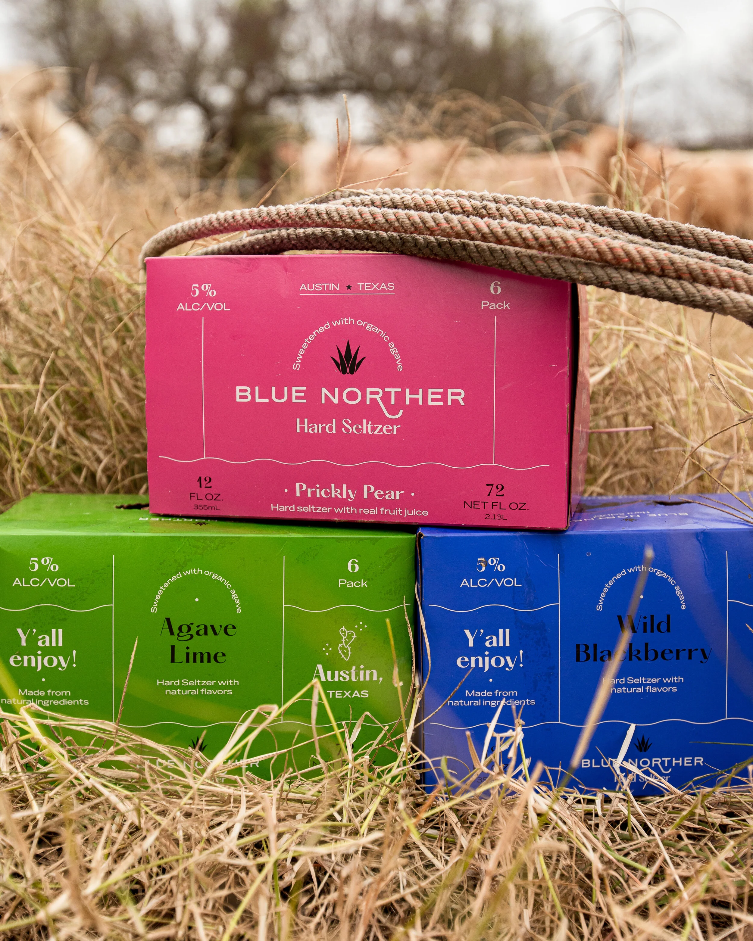
Blue Norther challenged me to develop the visual brand identity to reflect it’s Austin roots and bold flavors, while also standing out against the clutter of other seltzer brands. After the three individual flavor boxes were launched, we realized that our boxes should include fruit imagery when it came time to create the Variety Pack Box.
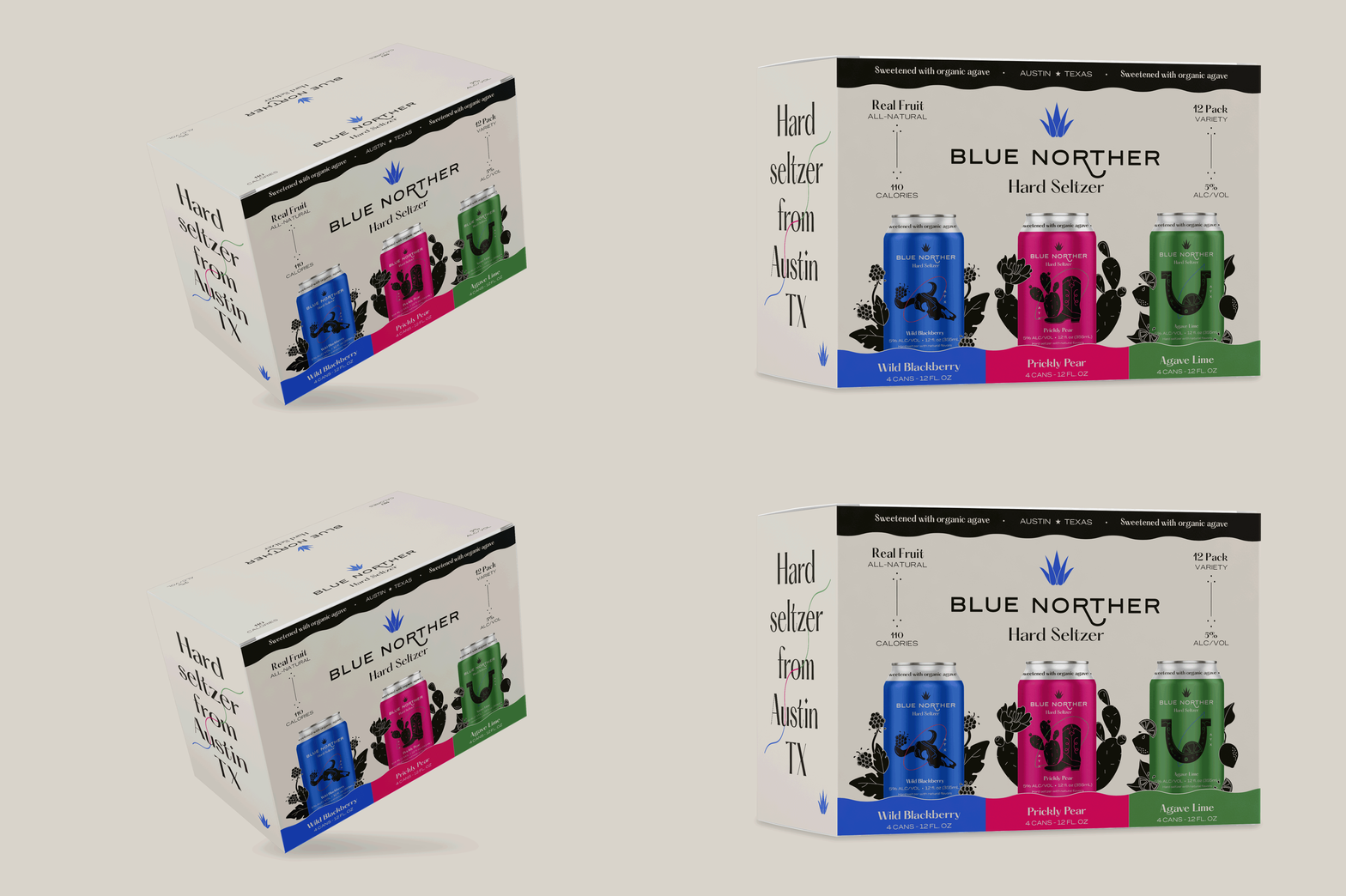
The result was a sophisticated, warm grey box that divided the three flavors with Texas fruit imagery that appear to be growing out of the cans. A black wave at the top holds some key brand markers and brings balance to the cans that have similar wave broken by their corresponding flavor. This abstract wave is a nod to the Austin river and the Texas blue norther winds.
The variety pack I designed will account for 60-75% of total sales.
LOGO
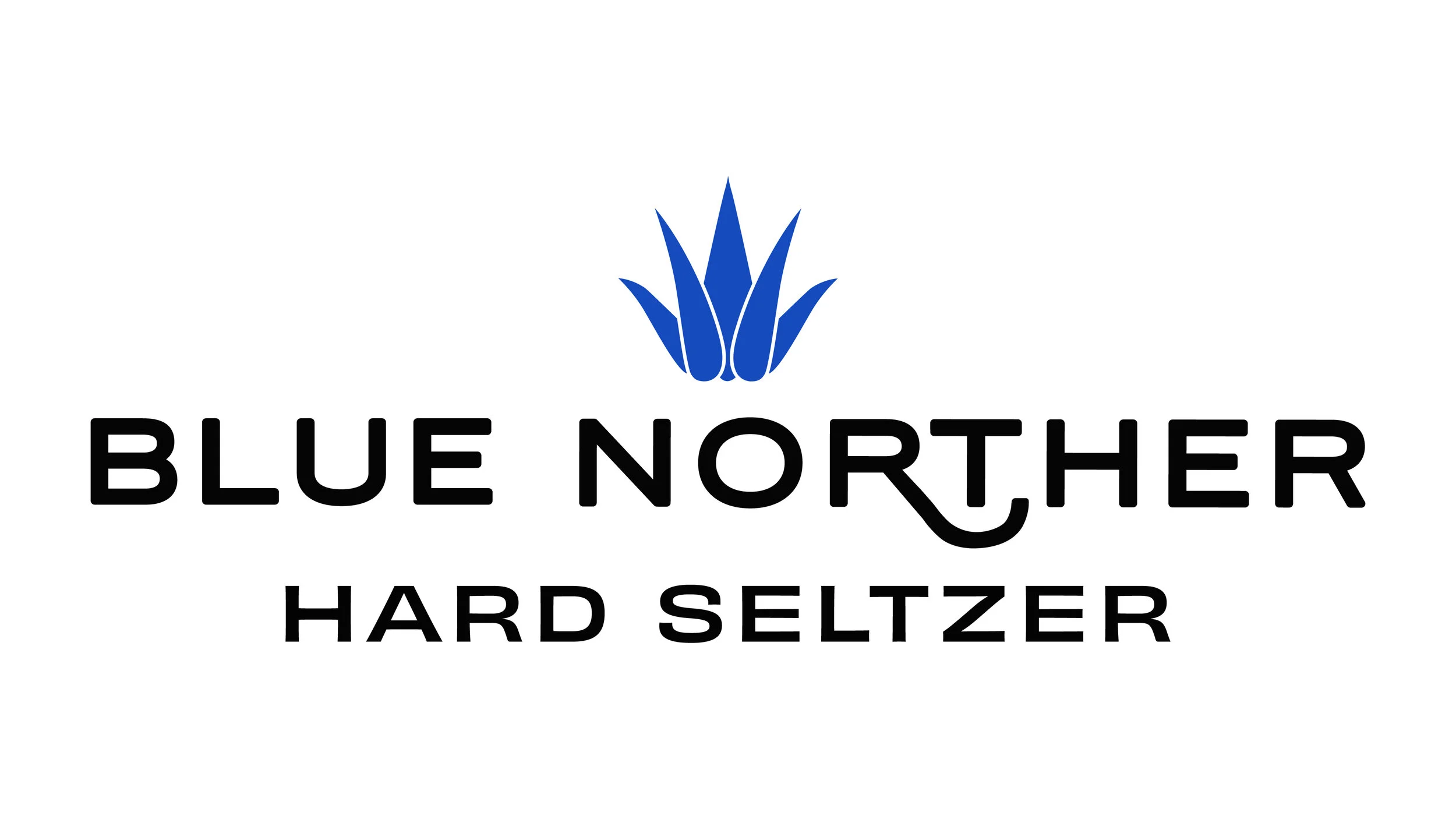
The biggest change was introducing a new, easier to read, typeface for ‘hard seltzer’ that paired with the font used for ‘Blue Norther’ and still had some personality to it.
After the first months of our seltzer being on the shelves, It was clear that the logo was hard to read at a small scale, especially ‘hard seltzer’. The new logo isn’t vastly different, but I tweaked several details to make it more clear.
Old Logo
New Logo
I shortened the ‘R’ in ‘Norther’, and adjusted it to hug the ‘T’ more. This ‘R’ represents the Texas native blue norther winds, but It didn’t have to be so long to be visually interesting and represent a wind current. I removed the outlines from the agave icon and slightly separated the individual leaves. The result was a logo that felt bolder, more unified and with our product category name much easier to read.
Marketing
PAID DIGITAL ADS
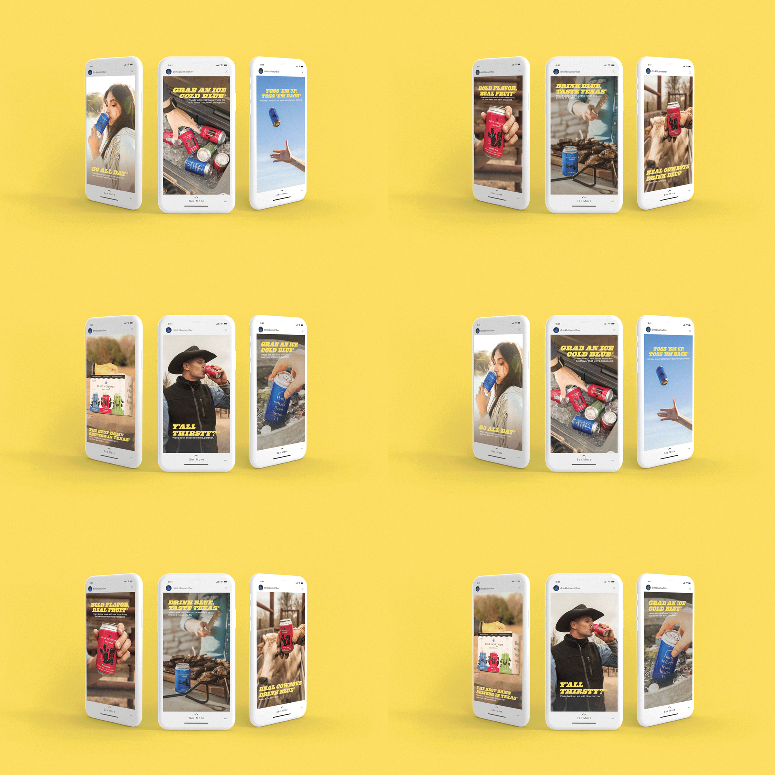
A major way I’ve been able to contribute to sales is through creating digital ad campaigns for targeted social platforms. The images above are Instagram stories that were released in Spring 2021, as we went into our high season. Our CMO and I concepted this ad campaign and reached 1.7 million new potential customers in 4 core markets at a 35% saturation. This campaign also generated 16 thousand website visitors,
2.9 million Thruplays, and 2.7M engagements at a 16% average brand recall rate.
I found and implemented the font Behemoth, (in yellow above) to be used for headlines in our brand. Then I created a custom photo editing style to help our creative look retro- western and ‘Cowboy Cool’ in alignment with the new typography for this shifted brand direction.
Project management
WEBSITE REDESIGN
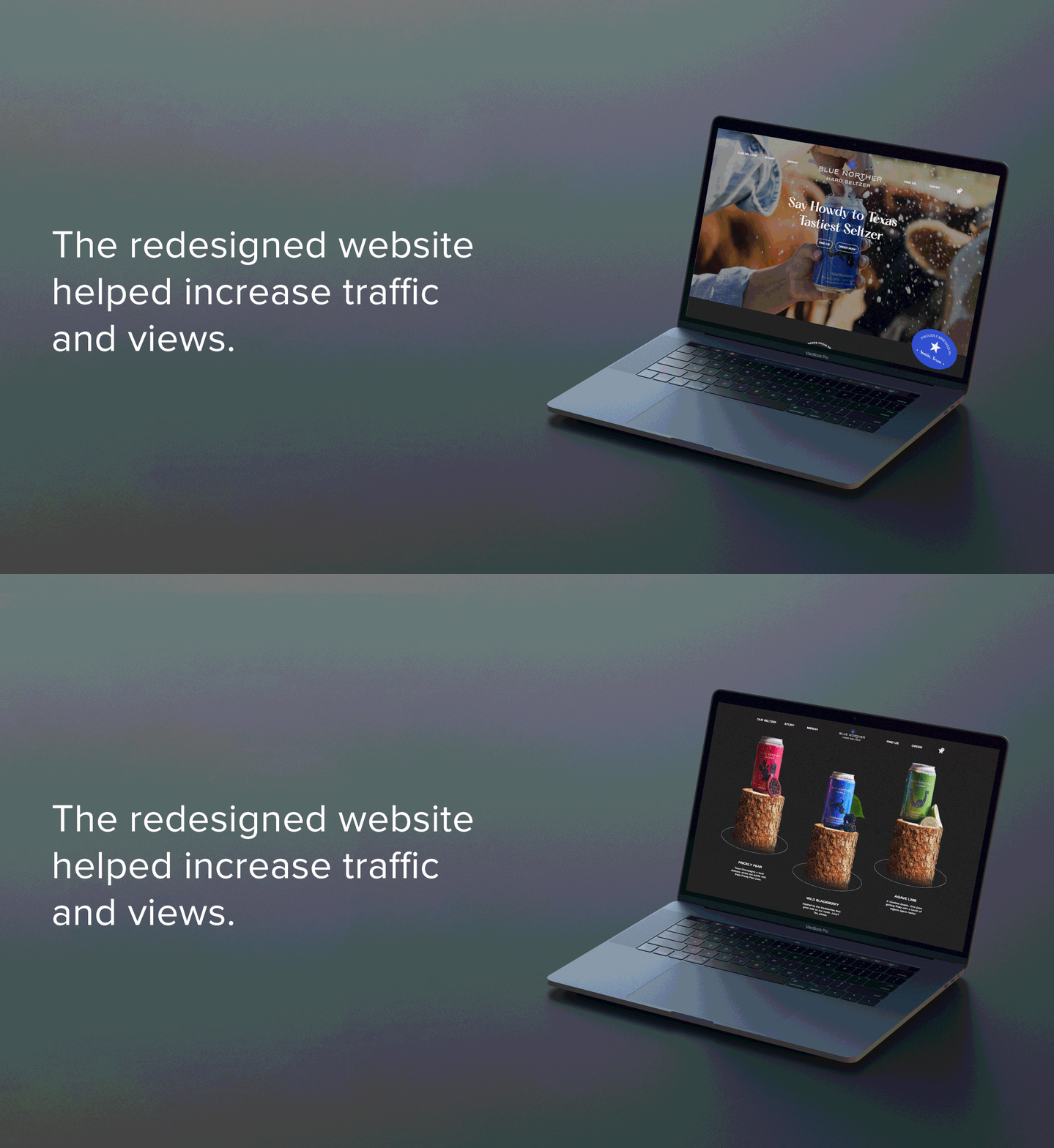
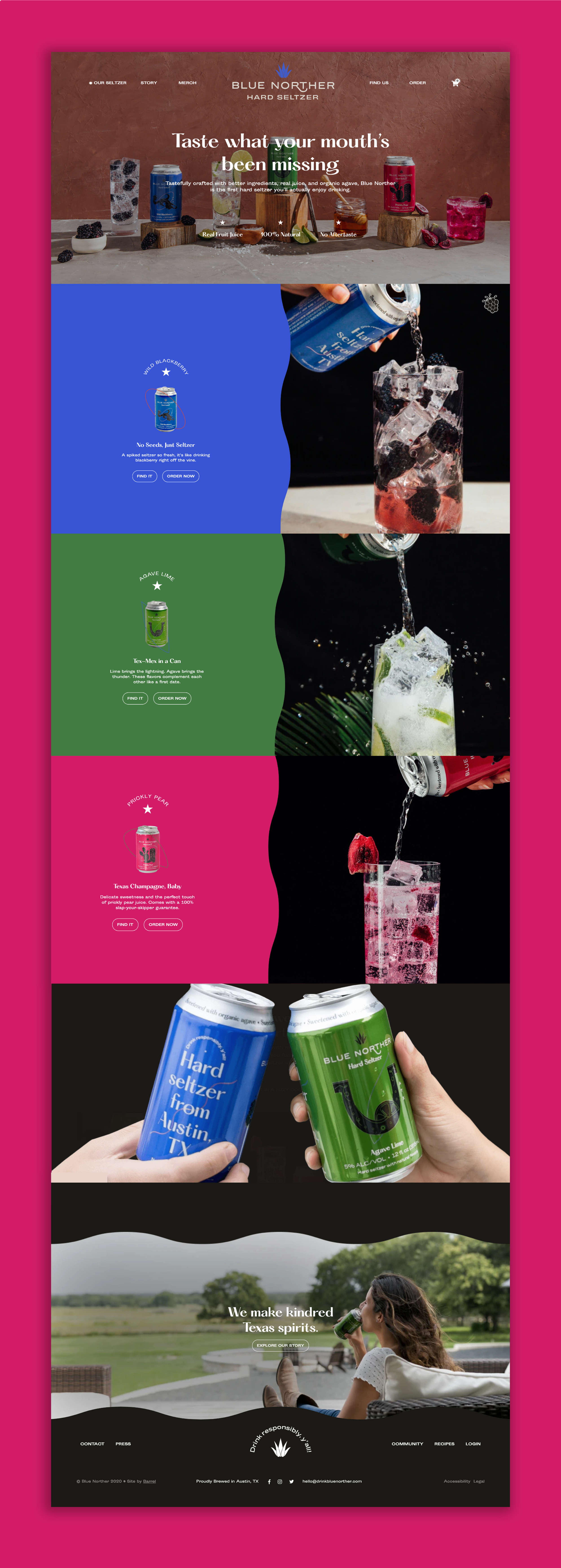
I helped usher this website redesign done by Barrel NY by creating illustrations, gathering all photos used, reviewing copy and ensuring our branding was engaging and consistent. The goal was to tell an engaging story to draw people into the brand, make it easy for customers to find out where to buy it near them and introduce a shopify aspect to the site. We also wanted to showcase our 3 main brand positioning points: taste, quality & heritage.
art direction
photo direction
photo process
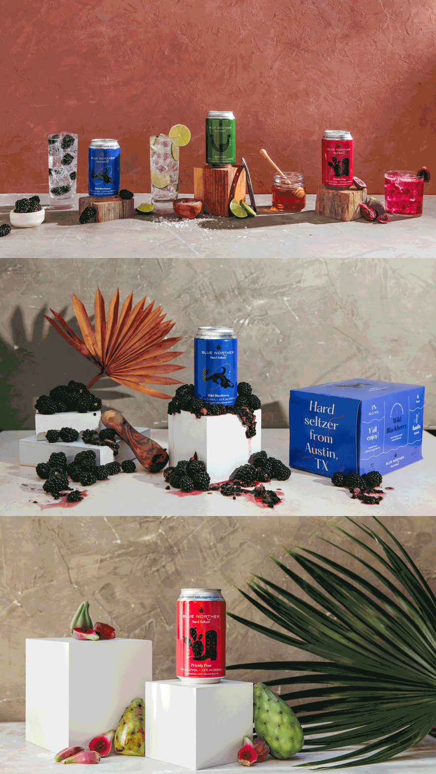
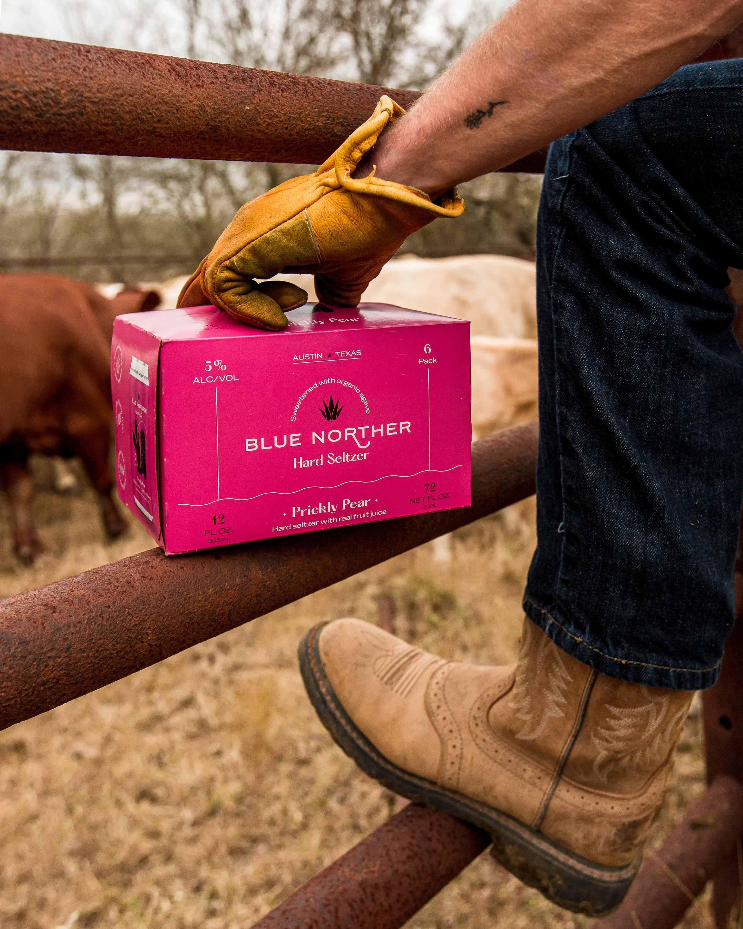
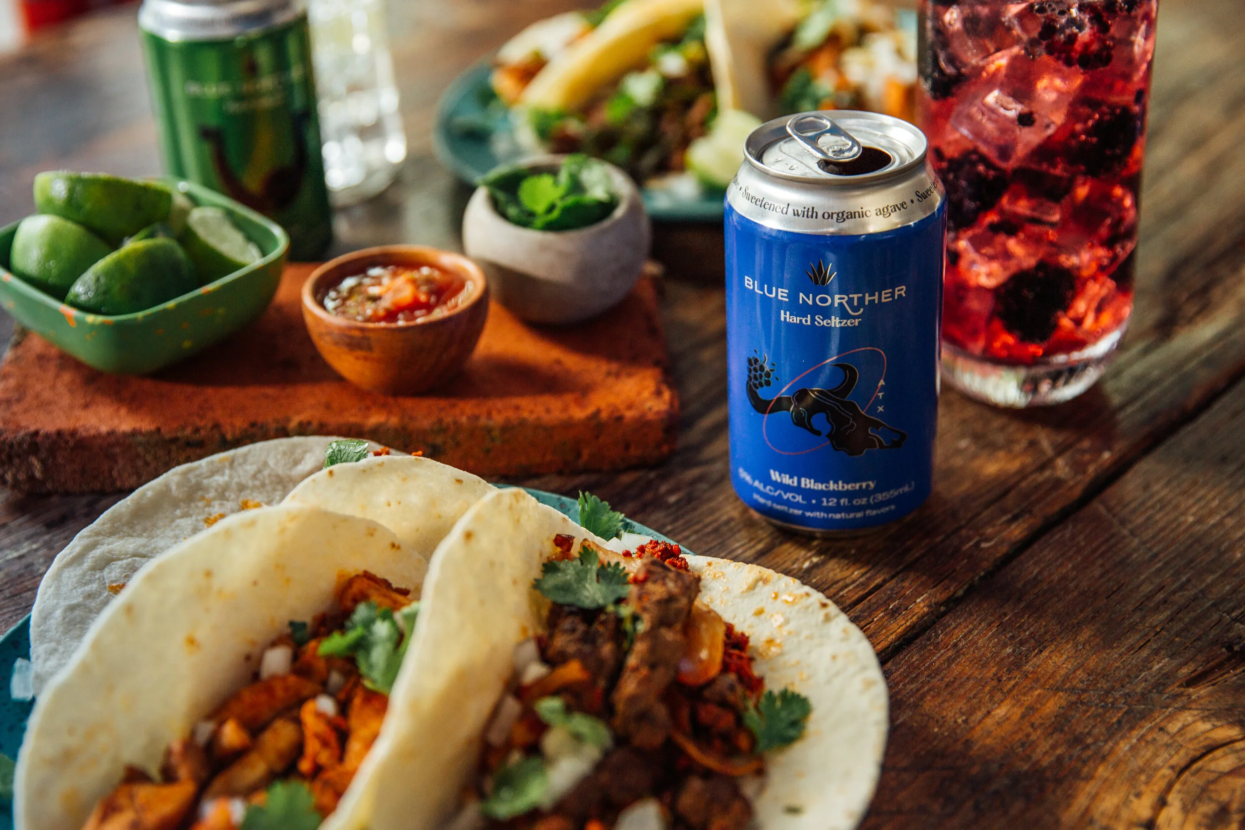
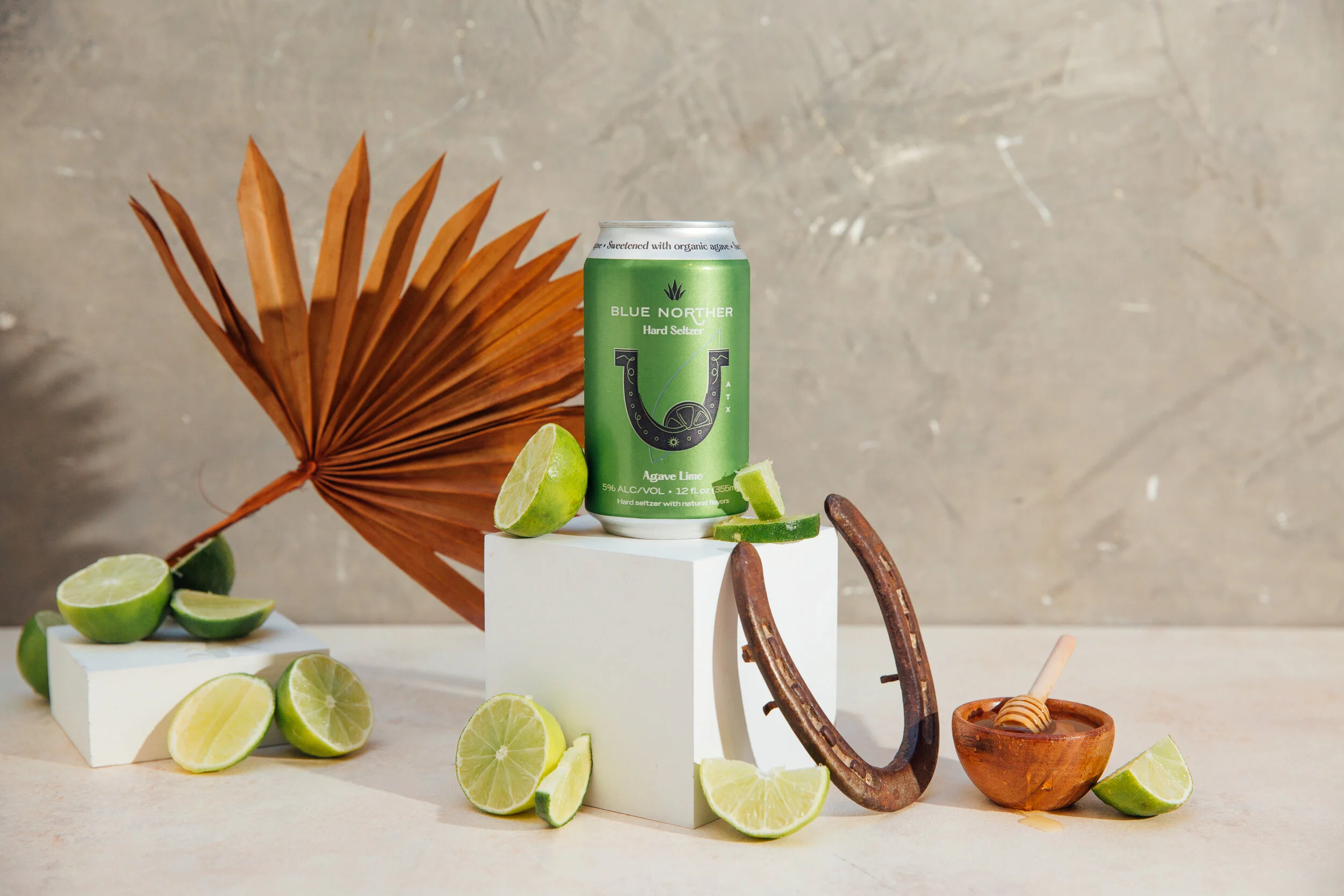
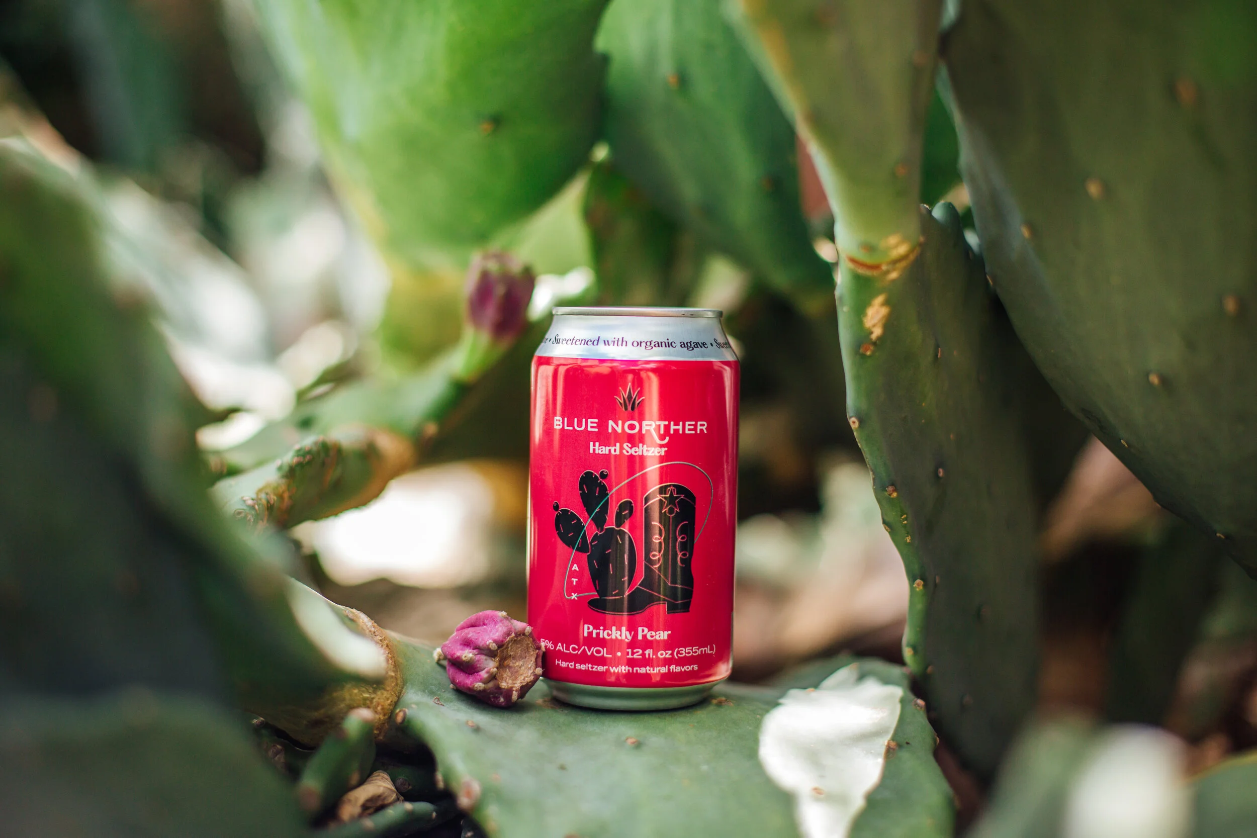
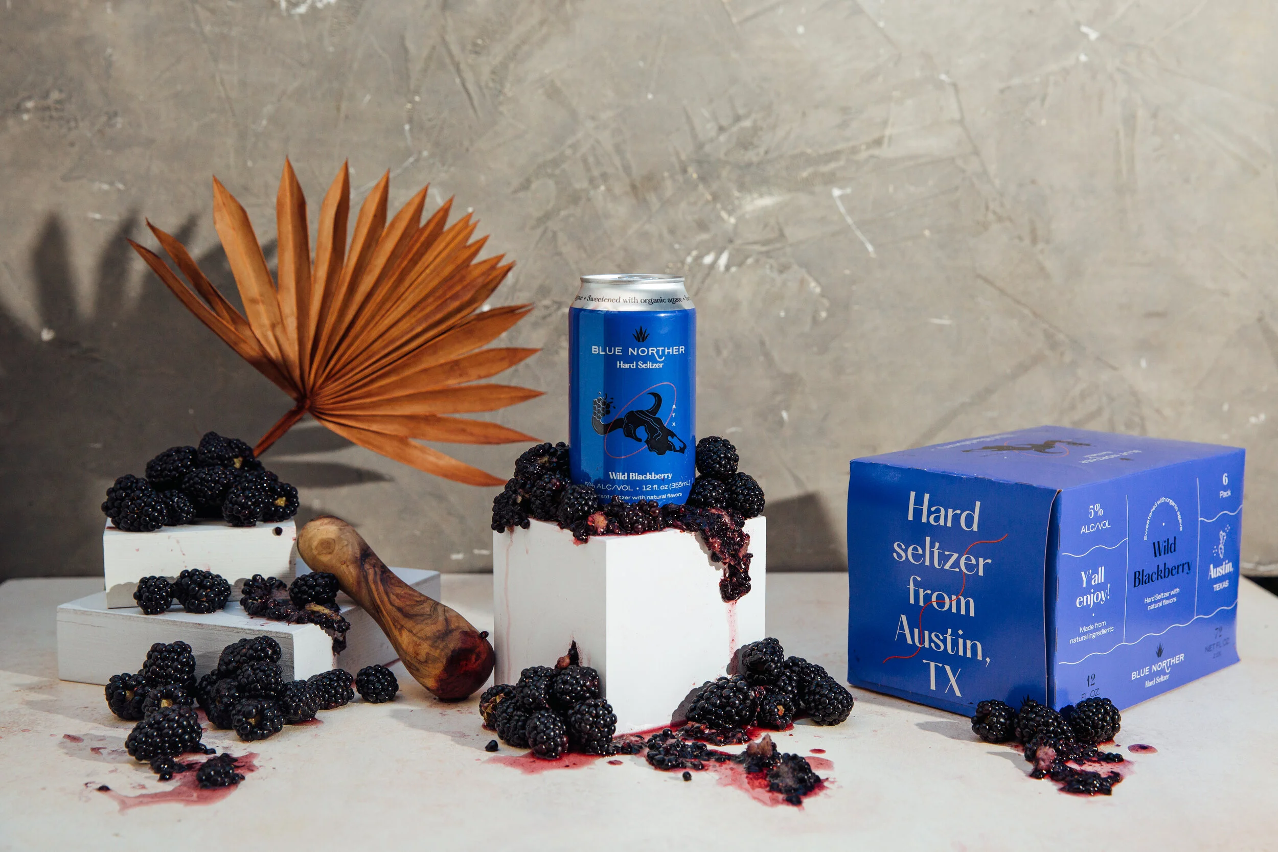
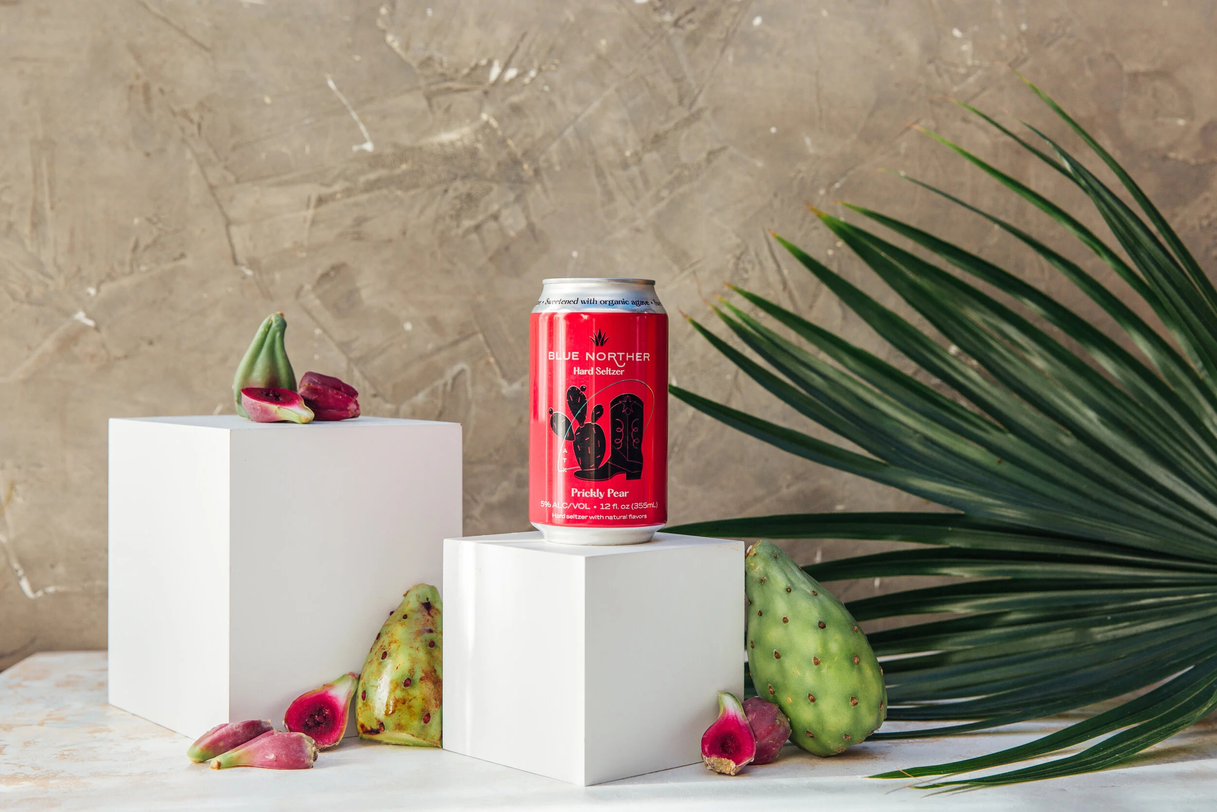
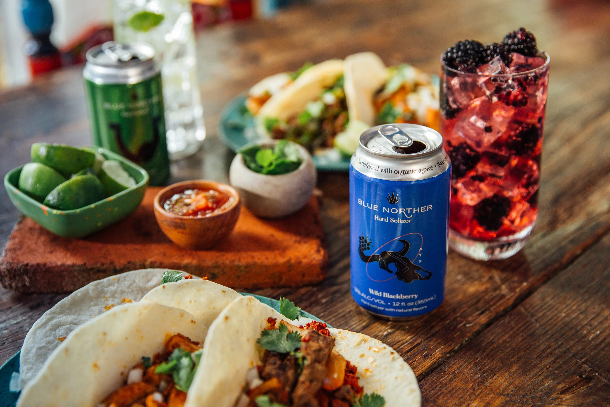
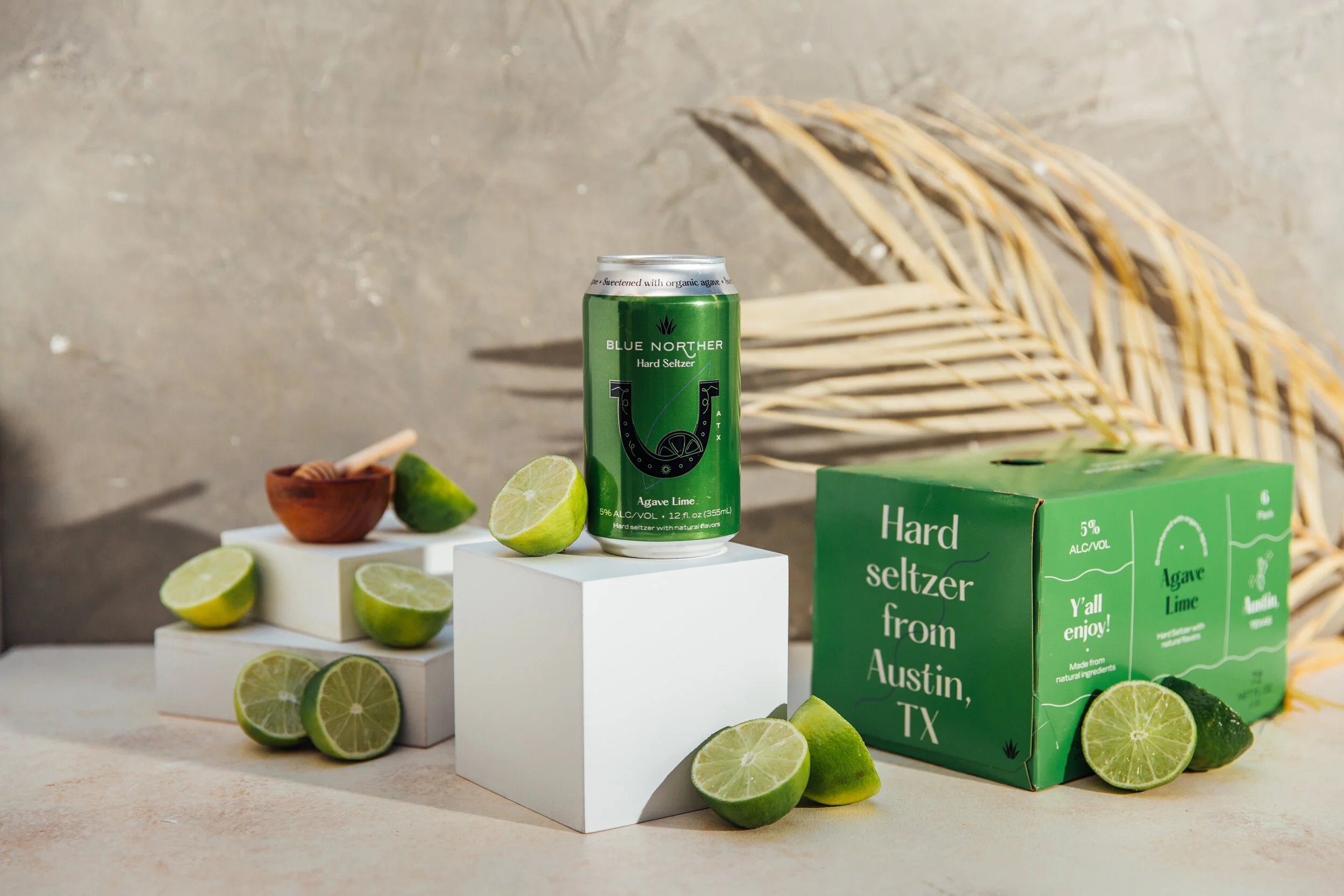
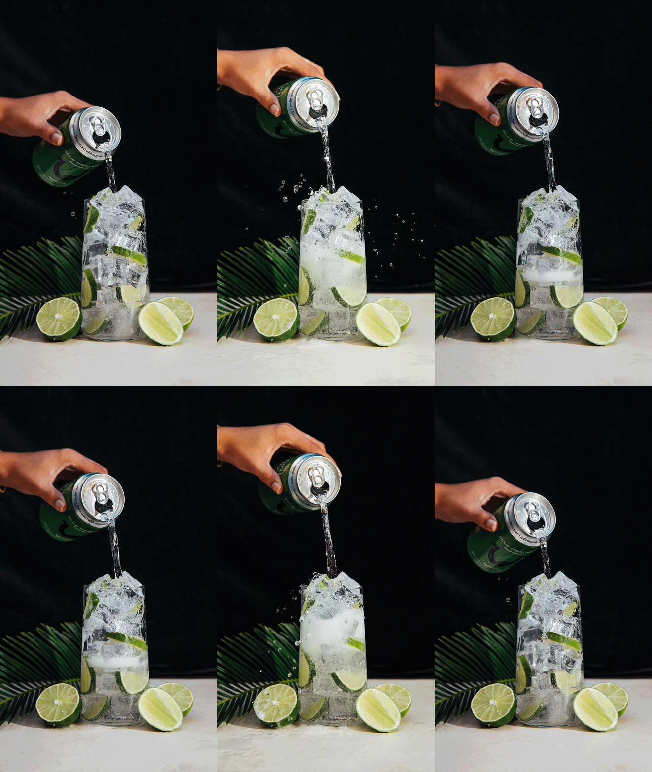
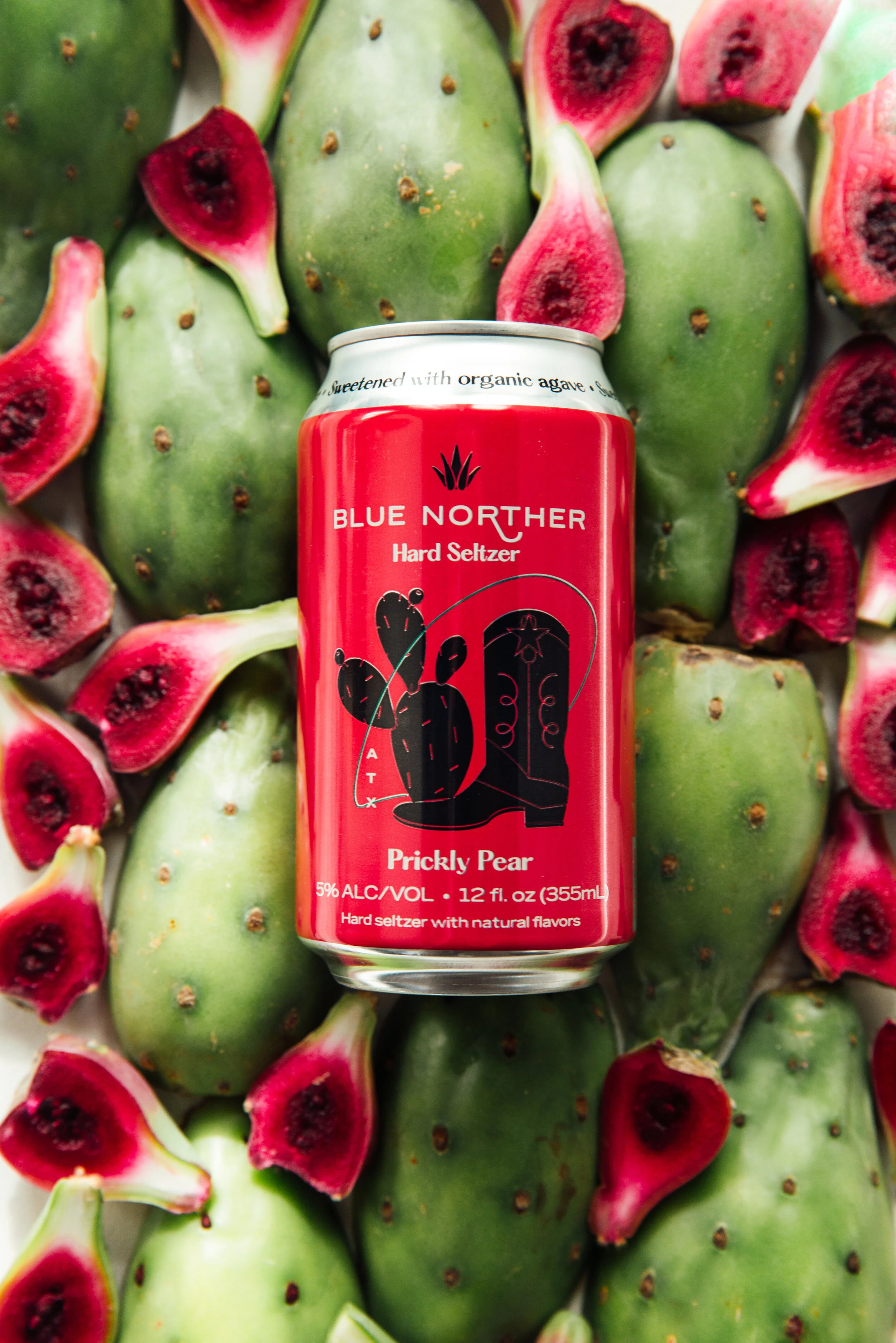
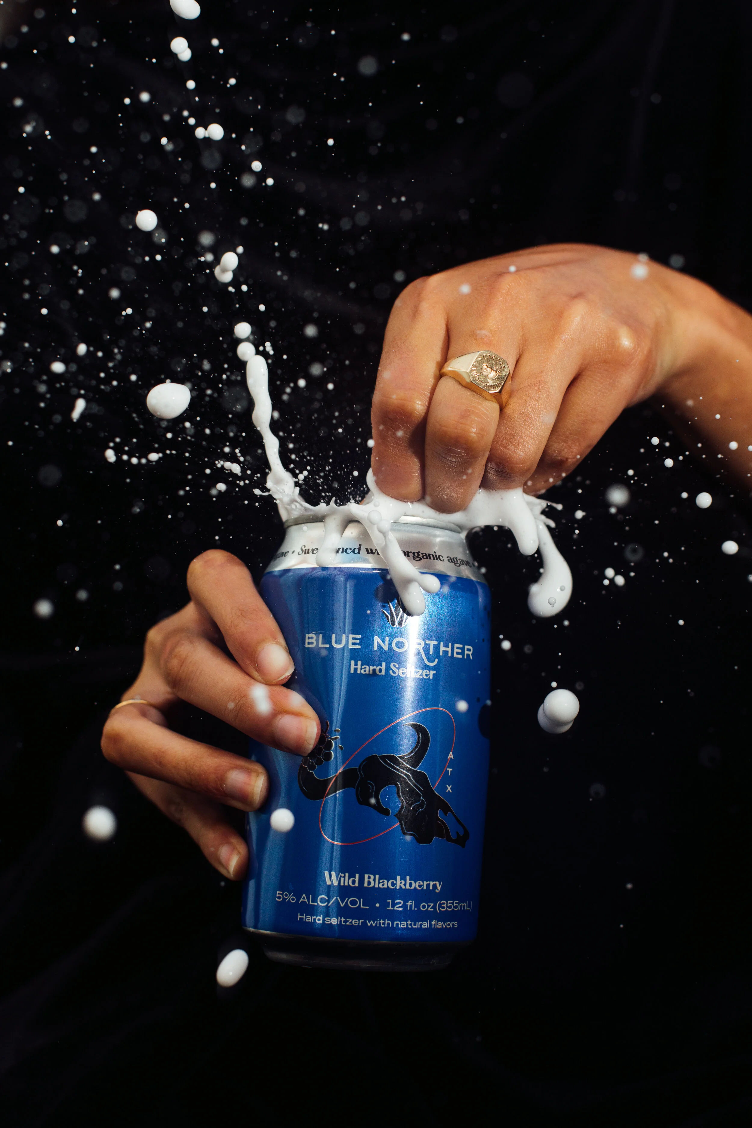
These photos were taken by photographer Ashleigh Amoroso. I concepted the mood board and shot list for these shoots, and helped select the textures and props to best represent the brand.
MERCHandise
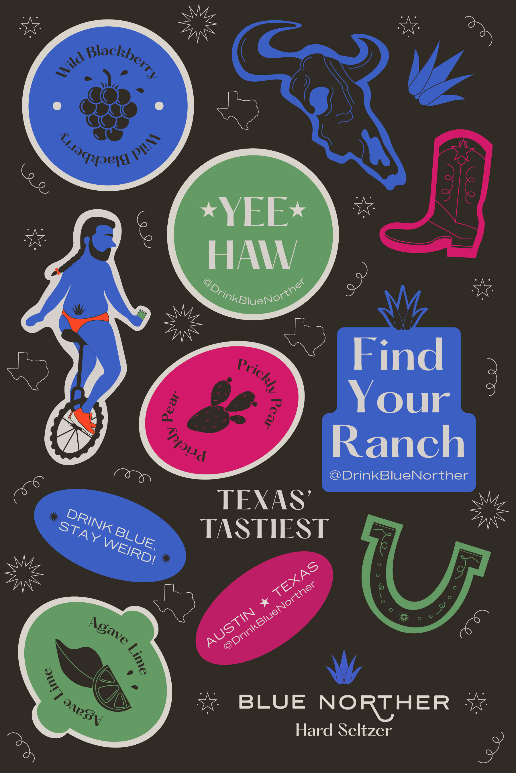
It was fun to design our collection of merchandise to be sold on our shopify and be given out through promotional or marketing events! A bandana, sticker sheet, limited edition t-shirt, tote bag, and hats were some of the merch I designed and had produced.

